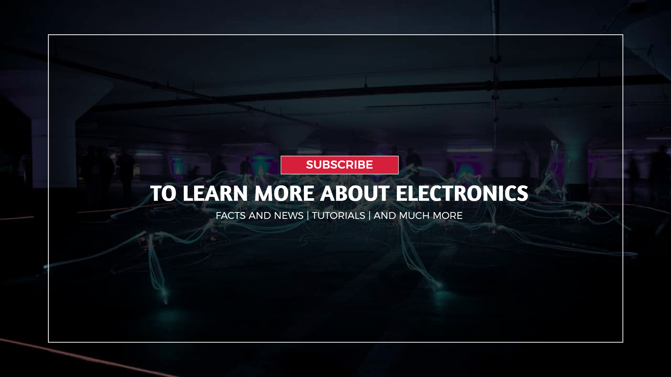
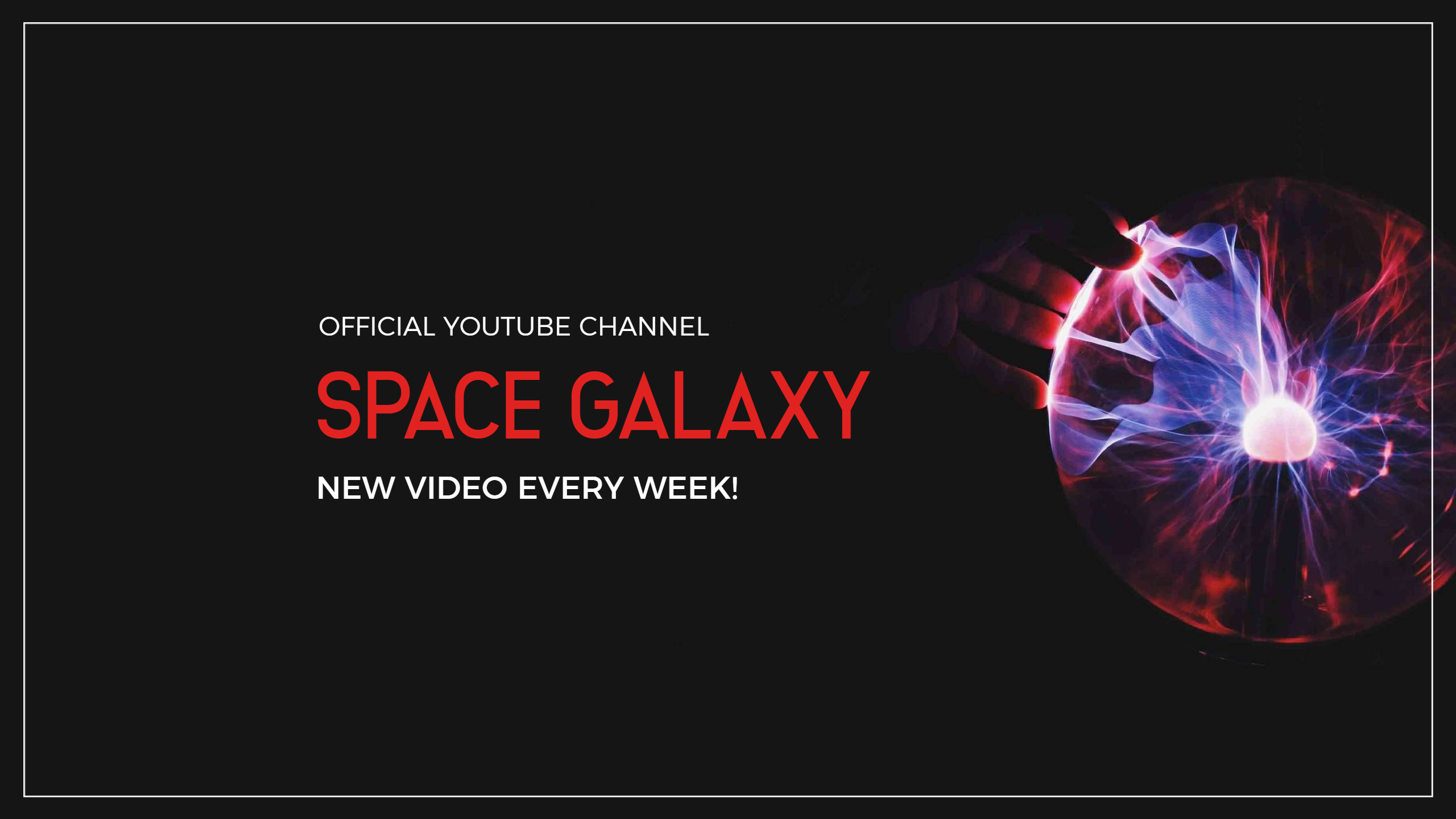
YouTube Banner: Do’s and Don’t
It’s crucial to learn how to create a strong YouTube banner since when you click into a channel, the channel art is typically the first thing you notice.
Your brand’s identity and the purpose of your channel are conveyed to viewers through your channel art. It’s possible to express creativity through channel art, and you can also use banner design to promote your channel.
Do: Take Excellent Pictures
Even while it is simple to shoot images with our smartphones, not all of them will look fantastic when blown up for channel art.
Choose high-quality photographs that won’t pixelate when enlarged when choosing amazing photos for your background. There are several free stock photo websites available to assist you in finding an image of the highest caliber that’s ideal for your channel.
Size is important when designing an interesting YouTube banner. The proportions of the image that shows at the top of your channel page are referred to as the YouTube banner size. In order for your banner to appear amazing and display correctly on all devices, it is crucial to pick the appropriate size.
Do: Put your channel name in.
Although it might seem obvious to include your channel name in your banner, ambitious YouTubers sometimes forget to do so. Your channel name is already on the page, but it is tucked beneath your channel art and doesn’t stick out. By displaying it in a large font, you may make it more obvious to viewers.
In the event that there are other YouTubers with names identical to yours, having your channel name visible in your banner also ensures that visitors land on the correct page.
Do: Include Upload Days
Regular upload days are crucial for increasing views and subscriptions. Viewers can anticipate new videos from you by knowing your specific upload days. When I first started my channel three years ago, I erred by omitting upload days. Because my followers didn’t know when I would submit videos, my views decreased.
If you discover that you are unable to commit to a specific upload day, try including how frequently you will post in its place. Say, “New Videos Uploaded Weekly,” for instance. When you tell viewers when you upload, they will respect you more and might possibly subscribe. They require a promise that you will soon make another posting.
Do: Include Social Media
We live in a social media generation, so it’s crucial to include social media profiles in your channel art (YouTube Banner). Every minute of the day, people are using social media. Asking people to follow you on social media is an important practice if you want to take your YouTube channel seriously.
People can find you on social media by clicking on the social media buttons in your channel art. You should also include your current social media accounts in your banner because you might occasionally switch to a new one or stop using an old one. You might use Twitter for months before deciding that you prefer Facebook. Subscribers no longer have to rely on a guess as to which social media account to follow.
Do: Include a Brief Channel Description or Tag Line
To explain to your viewers what your channel is about, you should also provide a concise channel description or tagline in addition to your channel name. You might include things like makeup tutorials, product reviews, or mommy makeovers if you want to become a beauty expert. Alternatively, you might use a catchy tagline that sums up the purpose of your channel, such as “Empowering Mothers Through Makeup.”
I’ve seen that YouTubers that include two or three descriptive words in their channel art upload a wide range of videos, all of which fall into the same general categories.
YouTubers who utilize taglines do so in order to carry out a specific objective of helping or teaching people through the usage of their channel as a platform.
Whether you choose to utilize a tagline or descriptive phrases, both will greatly benefit your channel by establishing expectations for your visitors.
Do: Develop a recognizable brand.
Since I started my own YouTube channel, I’ve learned how crucial it is to pay attention to your branding. Pay close attention to the typefaces and colors you choose. Your channel’s color scheme has the potential to affect how your audience feels. For instance, utilizing yellow can convey happiness and vigor, while using blue can convey a more laid-back and tranquil attitude. Be sure the color you pick is a true reflection of who you are.
Choosing the proper typeface might be crucial for your channel. Today, a wide variety of fonts are accessible. Choose an accessible typeface that complements your channel when selecting a font. Even if you select a highly attractive cursive font, it may be ineffective if your audience cannot read it.
Don’t: Utilize Chaotic Patterns
Making your channel’s YouTube banner background made of patterns can make it look incredibly innovative and make it stand out from the competition. But, you could not get a lot of subscribers if you use a pattern that is disorganized and difficult to read. When using patterns, pick ones that don’t have a lot of colors or have a lot of lines or forms. The shapes and empty space within the pattern itself should be evenly distributed. Avoid using 3D patterns, which can interfere with the viewer’s vision and cause vertigo.
Don’t Use blurry photos
Don’t utilize photographs that are pixelated, fuzzy, or otherwise low quality. Utilizing fuzzy images gives an unprofessional impression.
That does not imply that you must employ a photographer to capture images for your YouTube channel. As long as there is enough light, the ordinary smartphone shoots really good images. Use a high-quality selfie or ask a buddy to take a good photo of you if you need a great photograph.
Don’t: Use Outdated Pictures
Include a recent snapshot of yourself wherever possible. The majority of the time, viewers will also follow you on social media. They may become perplexed and lose interest if they notice that you have recent photographs on your social media accounts but not on your YouTube channel.
Don’t: Include Images That Have Nothing to Do with Your Channel
This small error might cost you a lot of subscribers. For instance, if your channel is dedicated to beauty tutorials, your channel art shouldn’t feature food images or you eating a burger. When a viewer clicks on your page, they initially see your channel art. You want people to be able to understand the purpose of your channel without having to search for it in the description box. Include all of the graphics that represent the many topics on your channel if it is about several different things so viewers will still understand what it is about. But be careful not to mislead your visitors about the true purpose of your channel.
Don’t: Use cut-off images and text.
YouTube supports its users by providing a free template for channel art that they can use as a model. The template offers three alternative views of how viewers of TVs, computers, and mobile devices would perceive your channel art. A common error is to create art from the TV’s perspective, which eliminates graphics and text for viewing on computers and mobile devices. It is important to construct your channel in the mobile dimensions . So that it will display without issue on computers and televisions and avoid the headache of having graphics cut off.
Conclusion
In conclusion, By following all the above tips you can make an engaging and informative YouTube banner. Moreover, you can grab more audience towards you. Here are some tips to promote your YouTube video.

