7 Major Ways Typography Impacts Magazine Layout Design

How Typography Impacts Magazine Layout Design
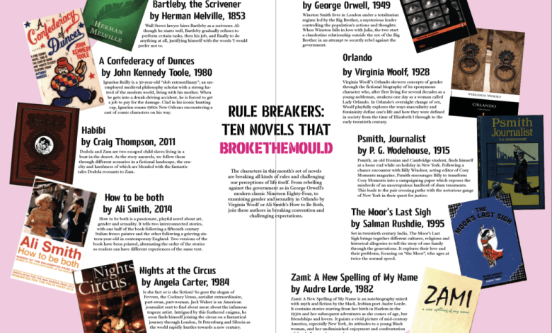
Magazine typography goes beyond simple text on a page – it shapes how readers experience each issue through careful selection of fonts, sizes, spacing, and placement across the publication’s pages. Typography brings together the visual and textual elements in magazine design to create a powerful reading experience that captivates audiences across print and digital platforms. Magazine designers must consider how different typefaces work together on physical pages while ensuring text remains clear and legible on digital screens of various sizes.
Well-executed typography transforms basic magazine layouts into compelling visual stories that draw readers deep into the content and keep them engaged from cover to final page. Expert typography stands as one of the most critical factors in professional magazine design, requiring careful attention to seven key aspects that determine how typography impacts magazine layout design.
Make Headlines Pop with Display Fonts
Magazine headlines need to grab attention fast. Bold display fonts with unique personalities work best for cover titles and section headers. Sans serif fonts like Futura look clean and modern. Script fonts add elegance to lifestyle magazines. The key is picking display fonts that match your magazine’s style. Test different sizes and weights until headlines command attention without overwhelming the page.
Create Hierarchy Through Font Pairing
Good magazine design needs clear visual hierarchy. Pair contrasting fonts to show what’s most important. Use a bold serif font for article titles and a lighter sans serif for subheads. Body text works best in proven readable fonts like Caslon or Helvetica. Stick to 2-3 fonts per layout. Too many fonts create chaos and confuse readers.
Perfect Your Body Text
Body text needs to be highly readable. Choose fonts designed for lengthy reading. Set comfortable line lengths of 50-75 characters. Add enough line spacing to prevent eye strain. Body text that’s too small dense or light gray will frustrate readers. Make it easy for people to stay focused on your content.
Use Type as a Design Element
Typography impacts magazine layout design where it can function as a visual design element. Large initial caps draw readers into articles. Pull quotes in display fonts break up text walls. Type-only layouts with varied sizes and weights create striking magazine spreads. Let typography do some heavy lifting in your design toolbox.
Build Strong Grid Systems
Grids bring order to magazine layouts. Base your grid on your body text size. Allow proper margins and gutters. A solid grid system helps organize type consistently across pages. Readers may not notice good grids but they’ll feel the harmony they create.
Master Digital Typography
Digital magazines need web-safe fonts that display well on screens. Use sufficient contrast between text and backgrounds. Make type sizes flexible for different devices. Test layouts on phones tablets and desktop screens. Digital typography requires special attention to readability across platforms.
The right Typography impacts magazine layout design in a significant manner. Focus on readability first. Add personality through display fonts. Build clear hierarchies. Test thoroughly across formats. Great typography helps deliver your content while creating a cohesive visual brand. Take time to perfect these fundamentals and your magazine designs will stand out.


